

Imagine yourself walking into a bookstore, feeling the scent of new books, running your fingers over their covers. Your eyes catch the captivating typefaces dancing across the cover of your next favorite novel. In this article, we will see how typography helps in creating brand personality.
Typography has this magical ability to speak volumes before turning the first page. And this magic is not confined to books. In branding, typography is the unsung hero. It creates a persona and evokes emotions before you even read the first word.
The rhythm of different typefaces
Every font has its dance, rhythm, and character. Serif fonts like Times New Roman or Garamond exude a sense of tradition, respectability, and reliability. They’re the classical waltz dancers, elegant and timeless. On the other hand, Sans serif fonts like Arial or Helvetica are the modern salsa dancers. Their clean lines convey a sense of modernity, simplicity, and objectivity.
Then you have the script fonts like Pacifico and Allura. They’re passionate flamenco dancers. Full of creativity, style, and warmth. Let’s remember the display fonts like Bebas and Impact. The breakdancers of the font world. They are capturing attention with their bold, dramatic moves.
Typographic examples that reinforced brand personality
In 2018, Netflix moved from the widely-used Gotham font to a custom typeface named Netflix Sans. Designed in-house, Netflix Sans reflects the brand’s quirky, innovative, and forward-thinking personality. The font has clean, modern lines and minimalist design. It aligns perfectly with the simplicity and convenience that Netflix offers its users.
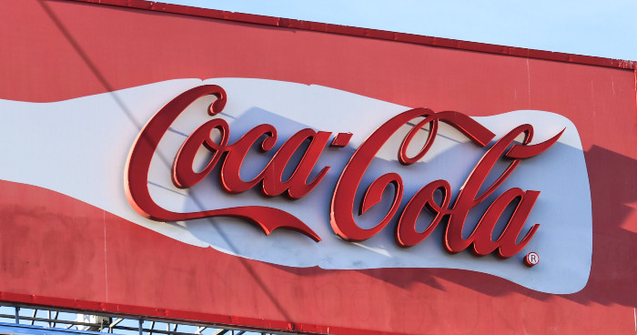
With its unmistakable Spencerian script, Coca-Cola transports us to a world of joy, happiness, and nostalgia. A world where we ‘Taste the Feeling’. On the other hand, Facebook uses a simple yet distinct Klavika typeface. It resonates with its mission of connecting the world, creating a sense of approachability and simplicity.

Apple exudes an air of modernity, sleekness, and innovation with its San Francisco font. It aligns perfectly with its cutting-edge technology products. Another exemplary case is the BBC. To maintain consistency across its diverse range of services, the BBC introduced BBC Reith, named after the corporation’s founder, John Reith. The font exudes readability and charisma, strengthening the BBC’s image as a reliable and accessible source of information.
Each of these brands has chosen a typeface that aligns flawlessly with their brand personality. Their choice of typography has played a crucial role in defining their brand’s story and emotional appeal.
The right typography for your brand personality
So, how do you choose the perfect dance partner, the ideal typeface for your brand? It’s all about aligning the font’s personality with your brand’s essence. Is your brand traditional or modern? Is it formal or casual? Does it aim to inspire trust or spark creativity? Answering these questions will help guide your choice of typography.
But it’s not just about the typeface. It’s also about how you use it. Your typeface’s size, spacing, and color all contribute to your brand’s personality and how your audience perceives it.
Pros and cons of custom fonts
In the ever-competitive branding landscape, standing out is essential. To carve out a unique identity, more and more brands are embracing the trend of custom fonts. Let’s delve a little deeper into this trend.
There are many pros of going with custom fonts.
For example:
- it allows a brand to have a unique typographic voice that aligns perfectly with its personality and values
- it shapes a brand’s identity
- adds aesthetic value.
It is a viable choice for some businesses, but not all.
Here are some cons to consider:
- licensing fees for existing typefaces can be expensive, particularly for global brands that operate across different mediums and regions
- designing a custom font requires considerable investment and expertise. It’s not just about creating aesthetically pleasing characters but ensuring readability, versatility, and effectiveness across all platforms and sizes.
However, it offers an exciting opportunity to create a unique, consistent, and impactful brand voice for brands that can invest the resources.
Conclusion
Typography is indeed a powerful tool in your branding arsenal. It gives your brand a voice, a personality, a soul. By making mindful typographic choices, you’re not just choosing a font. You’re selecting the emotions you want to evoke, the story you want to tell, and the personality you want to project.
So, let your brand dance to the rhythm of typography, creating a symphony of emotions, experiences, and connections.
If you are interested in more articles about empowering your brand, check out these: